

Nowadays, you need to be a perfectionist and make a perfect online store to gain new customers. There are millions of online stores, you have to make something new and different, but also keep the standard things standardized, to stand out from the digital crowd.
To better the chances of your online eCommerce platform, let’s get through the top 10 things that everyone likes to see when buying online.
This article is a fantastic addition to our last How to prepare your store for the peak season tutorial.
Navigation usability
The ease of navigation should be a top priority for every web developer. The majority of websites annoy you with confusing navigation.
If I think about the most important factors of easy and usable navigation I would mention:
- Predictability - In the case of usability, navigation uniqueness is not a preferred feature of clear and easy navigation.
- Simplicity - Navigation should be simple, even if you don't like it, minimalism is the desired approach for creating a website menu.
- Consistency - It's very important to keep the same theme and structure of your pages consistent. When a user visits your store, he or she is going to think about it in just a matter of seconds. After that, every user is going to expect all the pages to be similar in terms of design and general structure. Different navigation structures page by page will result only in frustration.
In the context of navigation consistency, we can distinguish the location of the menu, on smartphones it will be the bottom of the device, on tablets it will be a sidebar menu, the location of elements related to the purchasing experience.
The simplicity may be related to Hick's law or the Hick Hyman Law. Hick and Hyman were psychologists. Law describes the time it takes for a person to make a decision as a result of the possible choices: increasing the number of choices will increase the decision time logarithmically. The Hick–Hyman law assesses cognitive information capacity in choice reaction experiments. The amount of time taken to process a certain amount of bits in the Hick–Hyman law is known as the rate of gain of information. (Source)
Clean interaction means a physical interaction with users. You should go into customers' heads and try to explore your store in the same way they do. Take into consideration that you know the store, products, catalog structure, but if any of the elements causes you to think even for a moment, it will mean that the interface should be improved.
Expert tip: Don't forget about the devices - especially mobile devices. You should consider the area of the interaction. Avoid placing buttons, forms in the area that can't be easily reached by a single finger.
Fast and intuitive checkout
We have already talked about it many times, but we really think that is a critical part of every online business. You have to, not just need to, you have to wear your customers’ shoes and check the whole purchasing process, it’s just the first step.
It’s also very hard to act like a newbie customer because you’ve created this store, so the majority of things are already familiar to you and it would be hard to look at them from the outside. 1 in 10 people who abandon their cart does it because the checkout process was too long. During the seasonal peak, like Black Friday, Cyber Monday, or even the whole Festive Fever season.
There is an important tip for the existing stores. Take your checkout into consideration as a place to simplify firstly. Our systems are advanced, even other platforms are advanced, the current digital world gives you the possibility to collect an enormous amount of data, and it's very easy to ask for too much information that isn't useful for you at all. Your goal should be reducing the fields that aren't required and crucial for you to successfully provide the service.
Staff picks – One Page Checkout
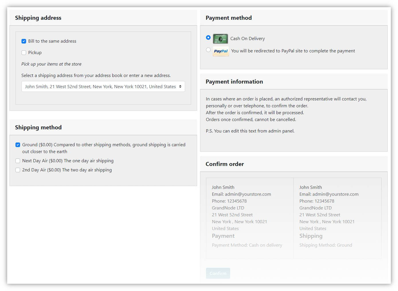
To create a seamless experience for your users, you can simplify the buying process even more than in the default version of GrandNode. To handle that, you should definitely look into our One Page Checkout plugin.
Clear pricing
There is nothing worse than hiding any kind of additional costs from the regular prices in your store. If you know that customers will have to pay for something, don't add those costs in the checkout. Inform about them as soon as possible, it will reduce the chance that customer will abandon their purchase due to additional costs. In my opinion, it would be better if you include any kind of additional cost to the base price of the product. Clear and straightforward communication is the key in that situation.
Variety of ways to pay
Nowadays we have almost unlimited possibilities if we talk about payment methods that can be used in online stores. We are no longer limited only to PayPal or another main payment gateway.
12% of online store users canceled their last purchase because they weren’t able to pay with their preferred payment method.
GrandNode offers a huge variety of payment methods. Starting from the most popular like PayPal, PayU, Klarna, Stripe, Skrill, G2A.
Fast store load times
If one of your pages doesn't appear lightning-fast, your customer will move on to speedier online stores. With so many e-shops your customers don't have to suffer low-performance and slow websites. You have to know that the one-second delay in page load time has been shown in independent statistics, to cause a 7 percent loss in conversion and 11 percent fewer page views. Imagine what will happen after the year, if their daily income is equal to around $50,000.
Free shipping
Free shipping works like a charm in the case of the purchasing process. Customers love it. That's why the Allegro Smart program made a success. Free shipping to the Inpost Lockers was a game-changer.
GrandNode gives you the possibility to mark products with Free shipping label, you can assign free shipping to the
Special promotions
Abandoned Cart Reminders
If we look at the combined e-commerce sales of $738 billion in the US and EU, the potential for a 35.26% increase in the conversion rate translates to $260 billion worth of lost orders that are recoverable solely through better checkout optimization and developing abandoned carts reminders.
During your store audit, you should definitely look at our video tutorial – Abandoned Cart reminder in GrandNode. You can check it on our YouTube channel.
Reminders are a part of GrandNode's built-in features. You can use them to create different kinds of customer messages. For example, mentioned abandoned cart reminder, furthermore, it can be a set of automated emails sent after registration, completed order. There is only one limit - your imagination! If you want to read more about Customer Reminder, you should look at our short article about customer reminders.
Outstanding customer service
The best, but usually impossible is to have a 24/7 support service. But if it's not possible, consider using chatbots instead. For many businesses, chatbots may be a useful and automated way to provide customer support.
Avoid popups
Don't overwhelm customers with unnecessary popups. There is nothing worse than a website with a cookie popup, then a popup with the calling me to feature, then an advertisement popup, and finally an exit popup. It's definitely too much!
Try to make the cookies popup less offensive. Maybe a little notification at the bottom of the screen, avoid "We will call to you in 30 seconds" from our experience, I know that it doesn't work at all.